Building Adaptive Interfaces for Different Screen Sizes in Flutter
Imagine opening an app that feels perfectly tailored to your device, whether it’s a compact smartphone or a large tablet. This isn’t just good design — it’s thoughtful design. Adaptive interfaces not only make apps look great on different screens but also enhance usability, ensuring that users can interact comfortably and intuitively no matter where they are. By embracing adaptability, you’re creating experiences that feel personal, seamless, and future-ready.
Flutter provides tools like MediaQuery and responsive widgets to help developers design adaptable layouts effortlessly. This article delves into the principles and techniques for creating adaptive interfaces, supported by practical examples ready to run in DartPad.
In the previous article, Reusable Components in Flutter: Choosing Between Inheritance and Mixins, we explored how to design modular and maintainable Flutter apps by leveraging Dart’s inheritance and mixin features. We discussed when to use inheritance for extending core functionality and when mixins offer a cleaner, more flexible alternative. The article provided practical examples to help you build reusable components with ease, laying a strong foundation for scalable app development.
What is an Adaptive Interface?
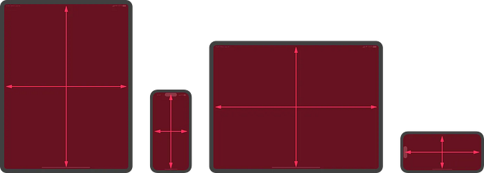
An adaptive interface responds to changes in screen size, orientation, and resolution to provide an optimal experience for the user. Unlike a static design tailored for a single device, an adaptive interface is versatile and accommodates a wide range of devices.
Why Build Adaptive Interfaces?
- Diverse User Base: Modern apps target users across various platforms and devices, from compact smartphones to large tablets.
- Improved Accessibility: Dynamic scaling of elements ensures better readability and usability for all users.
- Future-Proofing: With adaptive design, your app is prepared for new device categories like foldables and large-screen phones.
Principles of Adaptive Design
Before diving into code, let’s understand the core principles that guide the creation of adaptive user interfaces:
Proportional Scaling
- Avoid hardcoding dimensions. Use percentages or relative units to scale UI elements based on screen size.
- Example: Adjusting text size proportionally to the width of the device.
Flexible Layouts
- Use widgets like
Row,Column, andFlexto create layouts that expand or shrink based on the available space. - Add
ExpandedandFlexiblewidgets to distribute elements dynamically.
Responsive Behavior
- Detect changes in orientation and adapt layouts accordingly. For instance, show more content side-by-side in landscape mode.
- Widgets like
MediaQueryhelp you build responsive layouts effectively.
Usability in Focus
- Ensure interactive elements like buttons and icons remain large enough to tap comfortably, even on smaller screens.
By combining these principles, you can craft a UI that is not only functional but also delightful to use across devices.
Why Scaling Matters
Readability
- Text that looks perfect on a smartphone might appear too small or too large on a tablet. Scaling ensures that text sizes are proportional to the screen dimensions, improving readability.
Accessibility
- Scaled UI elements provide better accessibility for users with visual impairments. For instance, larger buttons and icons make the interface easier to navigate.
Consistency
- Scaling creates a uniform appearance across devices, maintaining the app’s design language and usability.
Dynamic Adjustments
- Apps that allow users to set custom text or icon sizes (like system-wide font size settings) can implement scaling to reflect these preferences dynamically.
Approaches to Scaling in Flutter
Flutter provides several tools for scaling text and icons dynamically:
MediaQuery
- Use the
MediaQuery.of(context).sizeproperty to retrieve the screen width or height, and calculate proportional sizes for UI elements.
LayoutBuilder
- Another way to manage scaling is by using
LayoutBuilder, which provides constraints of the parent widget. This is especially useful for responsive widgets in layouts.
FittedBox
- Automatically adjusts the size of its child widget to fit within the available space.
Device-Independent Units
- By calculating element sizes based on logical pixels (not physical pixels), you can ensure consistent scaling across devices with different resolutions.
Best Practices for Scaling
Test on Multiple Devices
- Simulate different screen sizes in Flutter’s Device Preview or on actual devices to ensure scaling works as expected.
Keep Proportions in Mind
- While scaling, maintain a balance between text, icons, and other UI elements. Avoid over-scaling icons relative to text, as this can disrupt the layout.
Use System Settings
- Flutter supports system-wide accessibility settings, such as font scaling. Ensure your app respects these user preferences.
Combine Scaling with Layouts
- Scaling should work hand-in-hand with responsive layouts. For instance, a scaled button should also adjust its padding and position dynamically.
Using MediaQuery to Detect Screen Parameters
One of Flutter’s most versatile tools for adaptive design is MediaQuery. It provides real-time information about the screen's dimensions, orientation, pixel density, and more. With MediaQuery, you can adjust layouts dynamically to fit different devices.
Understanding MediaQuery Properties
MediaQuery.of(context).size: Retrieves the logical pixel dimensions of the screen (width and height).MediaQuery.of(context).orientation: Returns the screen orientation asOrientation.portraitorOrientation.landscape.MediaQuery.of(context).devicePixelRatio: Provides the ratio of physical pixels to logical pixels.
Detecting Screen Size and Orientation
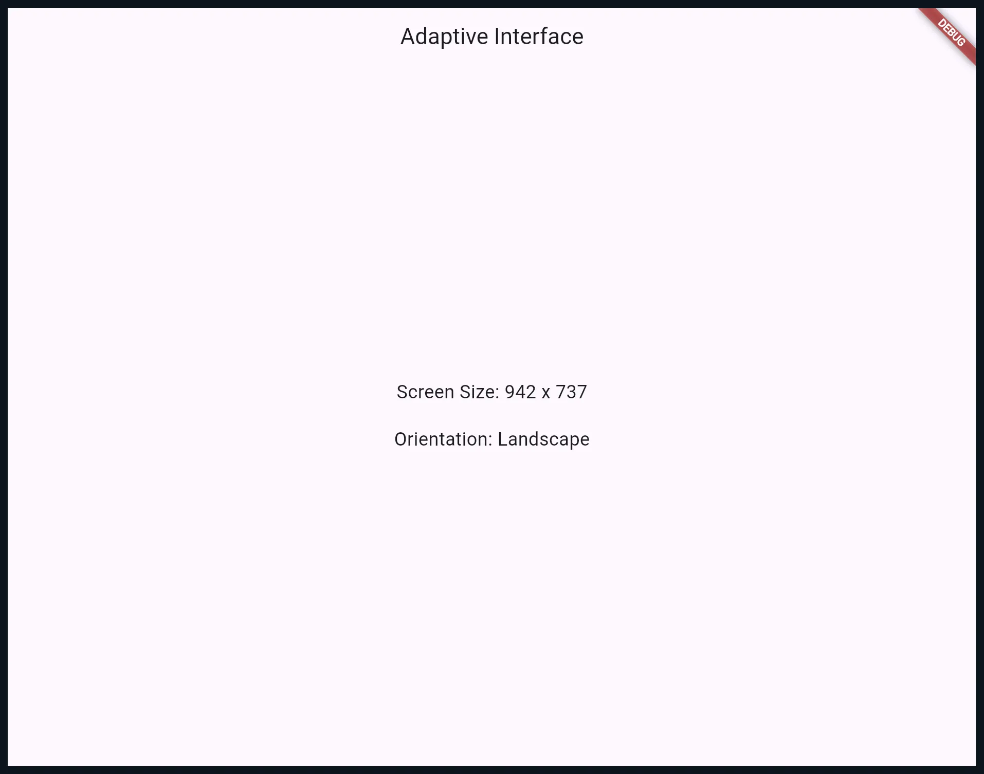
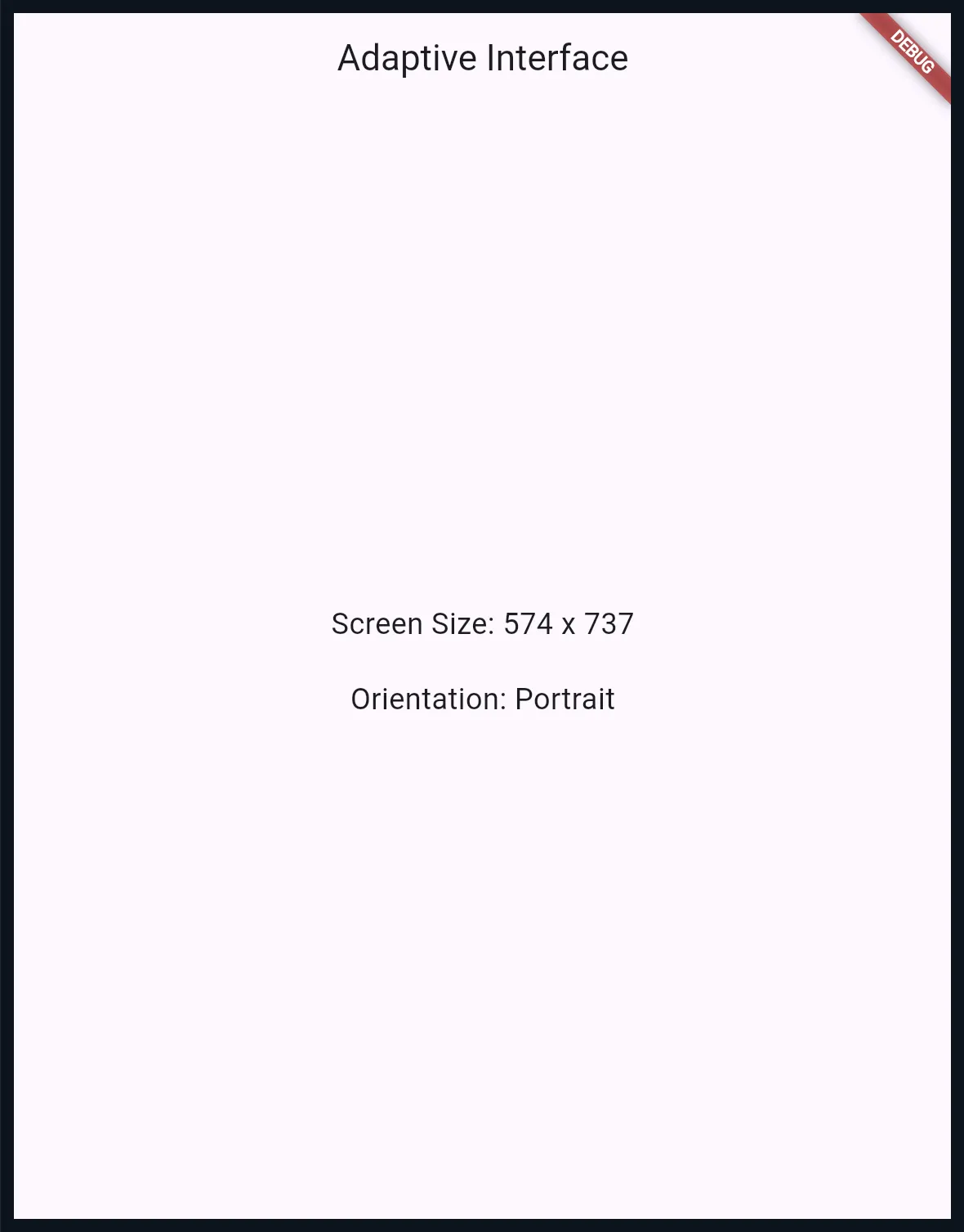
Let’s start with a simple example to display the current screen size and orientation.
import 'package:flutter/material.dart';

void main() {
  runApp(MyApp());
}

class MyApp extends StatelessWidget {
  @override
  Widget build(BuildContext context) {
    return MaterialApp(
      home: AdaptiveScreen(),
    );
  }
}

class AdaptiveScreen extends StatelessWidget {
  @override
  Widget build(BuildContext context) {
    // Obtain screen dimensions and orientation
    final mediaQuery = MediaQuery.of(context);
    final screenWidth = mediaQuery.size.width;
    final screenHeight = mediaQuery.size.height;
    final isLandscape = mediaQuery.orientation == Orientation.landscape;

    return Scaffold(
      appBar: AppBar(
        title: Text('Adaptive Interface'),
      ),
      body: Center(
        child: Column(
          mainAxisAlignment: MainAxisAlignment.center,
          children: [
            Text(
              'Screen Size: ${screenWidth.toStringAsFixed(0)} x ${screenHeight.toStringAsFixed(0)}',
              style: TextStyle(fontSize: 18),
            ),
            SizedBox(height: 20),
            Text(
              'Orientation: ${isLandscape ? "Landscape" : "Portrait"}',
              style: TextStyle(fontSize: 18),
            ),
          ],
        ),
      ),
    );
  }
}
This example demonstrates how to dynamically retrieve and display screen properties using MediaQuery.
Creating Adaptive Widgets
While MediaQuery provides essential data, widgets like Row, Column, and Flex allow you to create responsive layouts that adjust based on the screen’s orientation or size.
Why Adaptive Widgets?
Adaptive widgets enable dynamic rearrangement of UI elements without requiring separate layouts for different devices. For example:
- Switch between a vertical
Columnand a horizontalRowlayout based on the screen orientation. - Scale icons and text sizes for better usability on larger or smaller screens.
Responsive Layout Widget
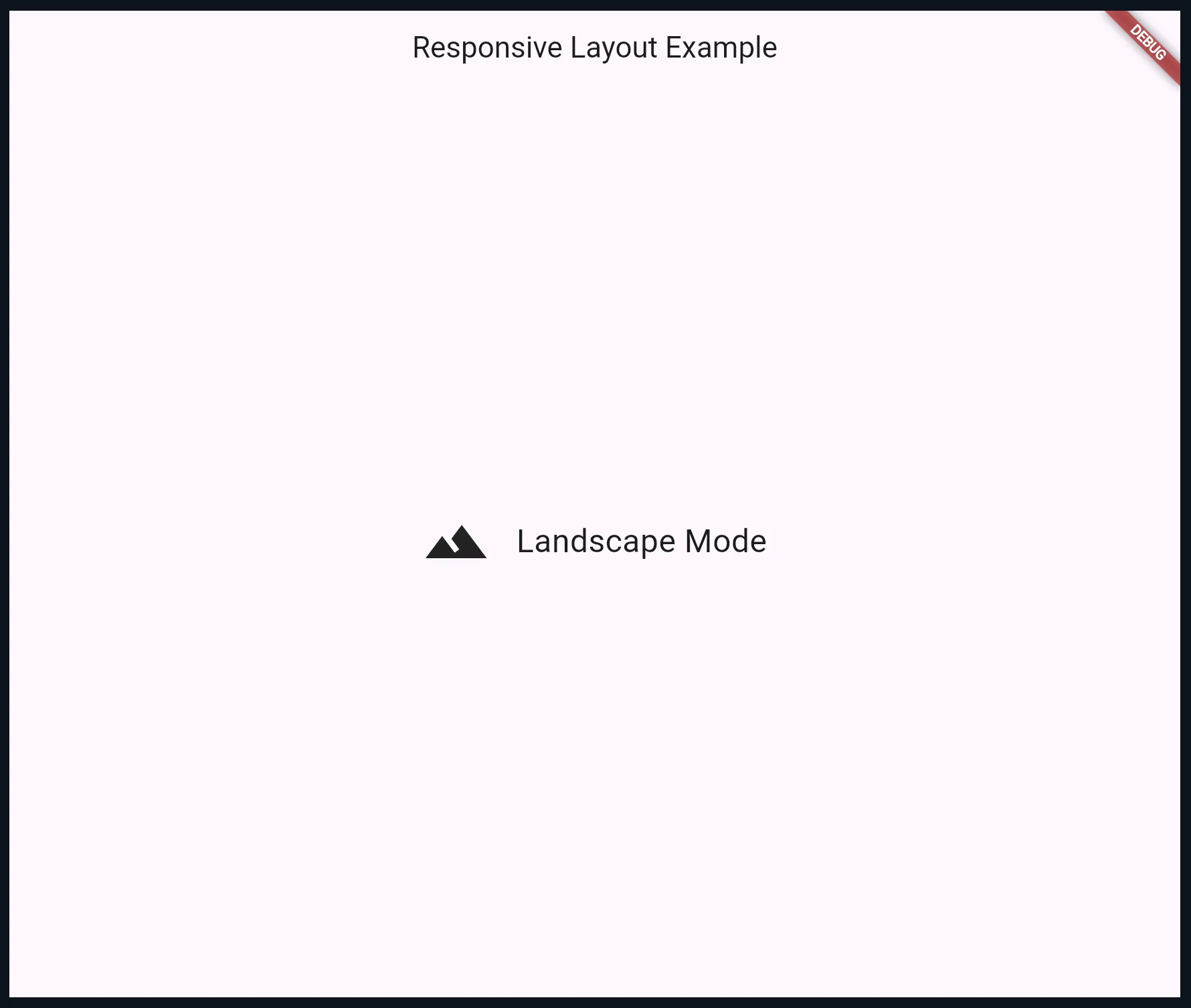
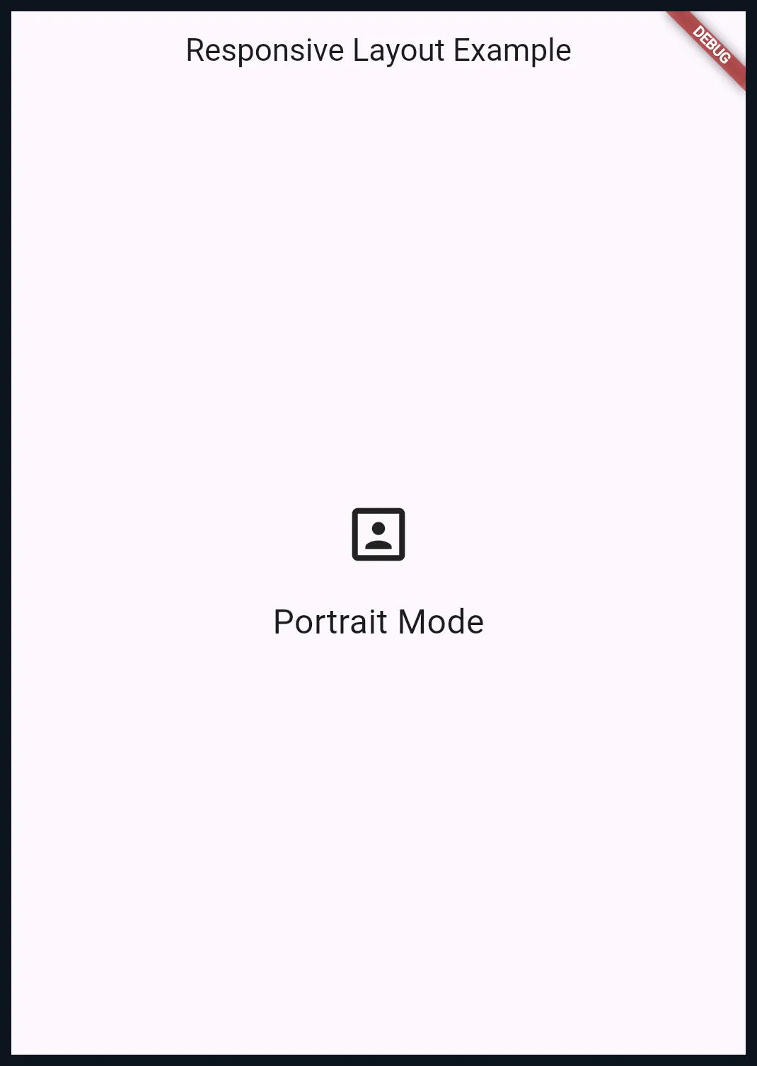
Here’s an example of a widget that switches between two layouts based on the device’s orientation.
import 'package:flutter/material.dart';

void main() {
  runApp(MaterialApp(
    home: Scaffold(
      appBar: AppBar(title: Text('Responsive Layout Example')),
      body: Center(child: AdaptiveLayout()),
    ),
  ));
}

class AdaptiveLayout extends StatelessWidget {
  @override
  Widget build(BuildContext context) {
    final isLandscape = MediaQuery.of(context).orientation == Orientation.landscape;

    return isLandscape
        ? Row(
            mainAxisAlignment: MainAxisAlignment.center,
            children: [
              Icon(Icons.landscape, size: 50),
              SizedBox(width: 20),
              Text(
                'Landscape Mode',
                style: TextStyle(fontSize: 24),
              ),
            ],
          )
        : Column(
            mainAxisAlignment: MainAxisAlignment.center,
            children: [
              Icon(Icons.portrait, size: 50),
              SizedBox(height: 20),
              Text(
                'Portrait Mode',
                style: TextStyle(fontSize: 24),
              ),
            ],
          );
  }
}
Scaling Text and Icons
In adaptive design, scaling plays a crucial role in ensuring that UI elements maintain their usability and aesthetics across various screen sizes. Without proper scaling, an app might look awkward or become difficult to interact with on larger or smaller devices.
Scaled Text Widget
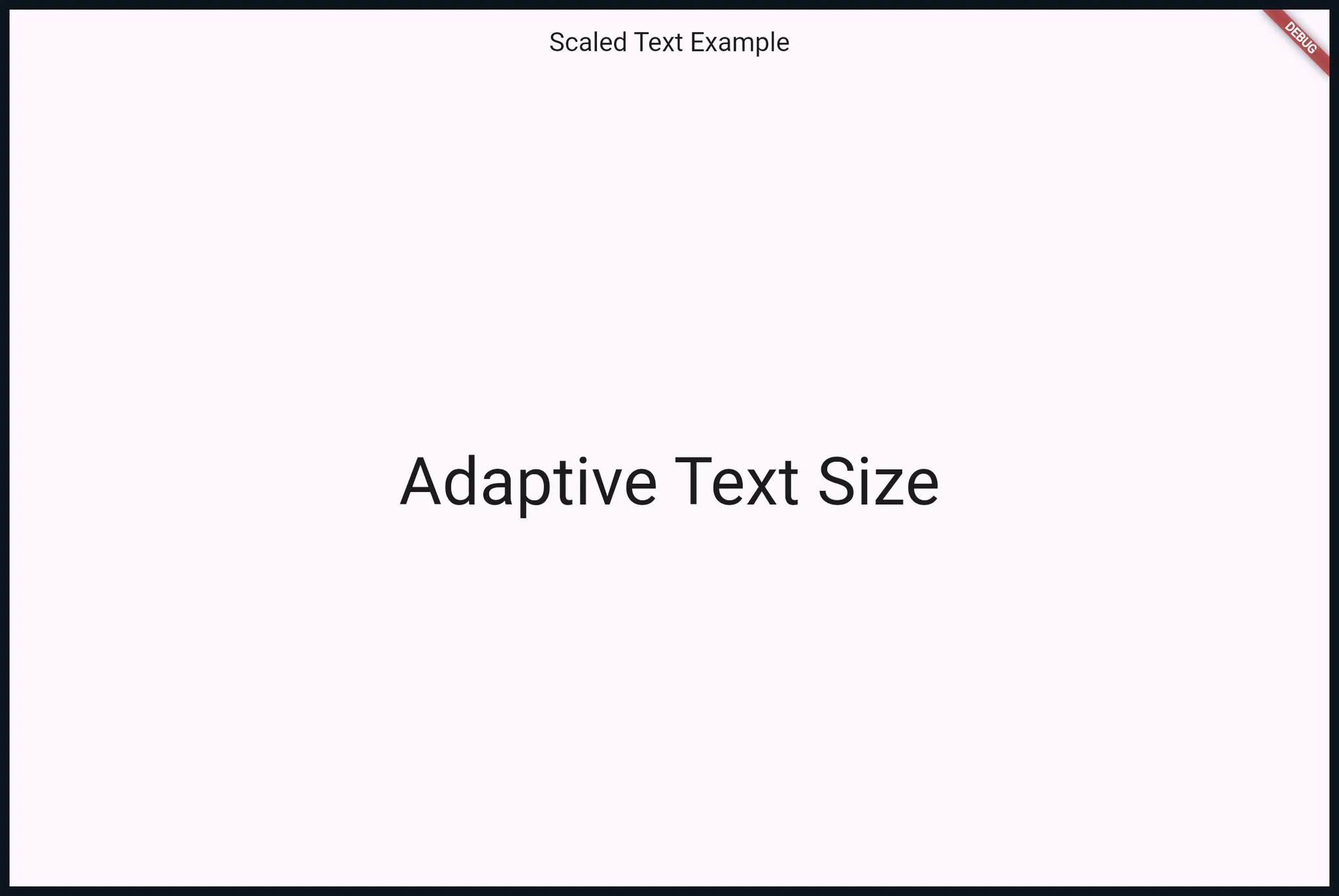
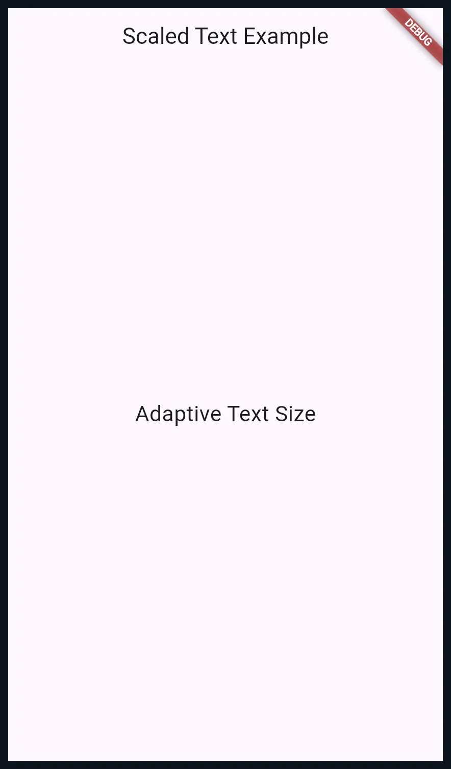
Here’s how you can create a text widget that dynamically adjusts its size based on the screen width.
import 'package:flutter/material.dart';

void main() {
  runApp(MaterialApp(
    home: Scaffold(
      appBar: AppBar(title: Text('Scaled Text Example')),
      body: Center(
        child: ScaledText('Adaptive Text Size'),
      ),
    ),
  ));
}

class ScaledText extends StatelessWidget {
  final String text;

  ScaledText(this.text);

  @override
  Widget build(BuildContext context) {
    final screenWidth = MediaQuery.of(context).size.width;
    // Scale text size based on screen width
    final textSize = screenWidth * 0.05;

    return Text(
      text,
      style: TextStyle(fontSize: textSize),
    );
  }
}
Scaling Icons
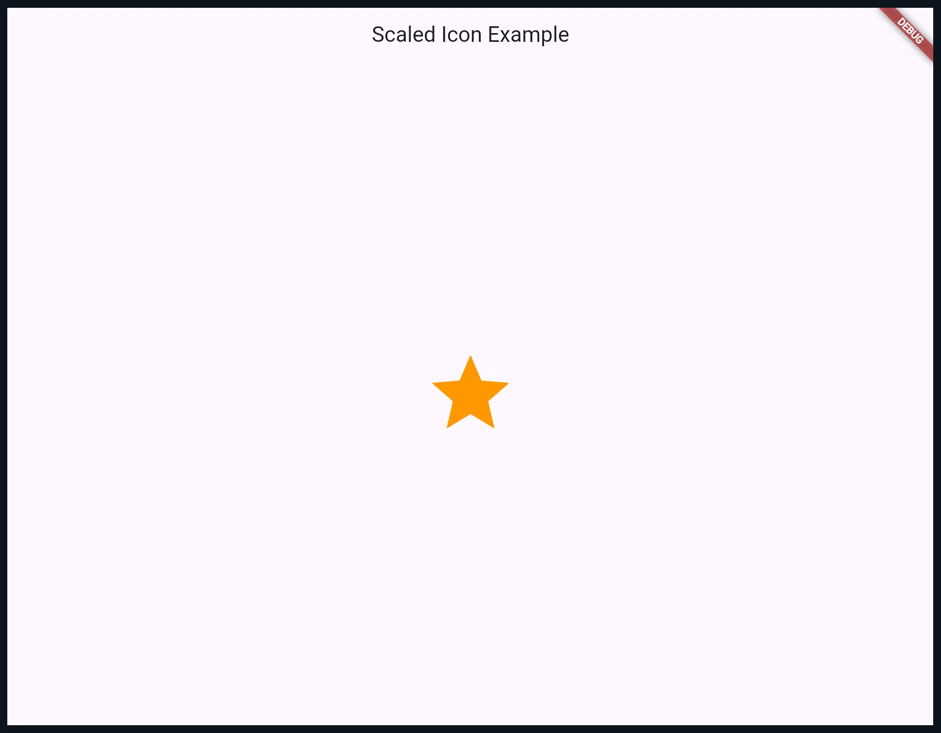
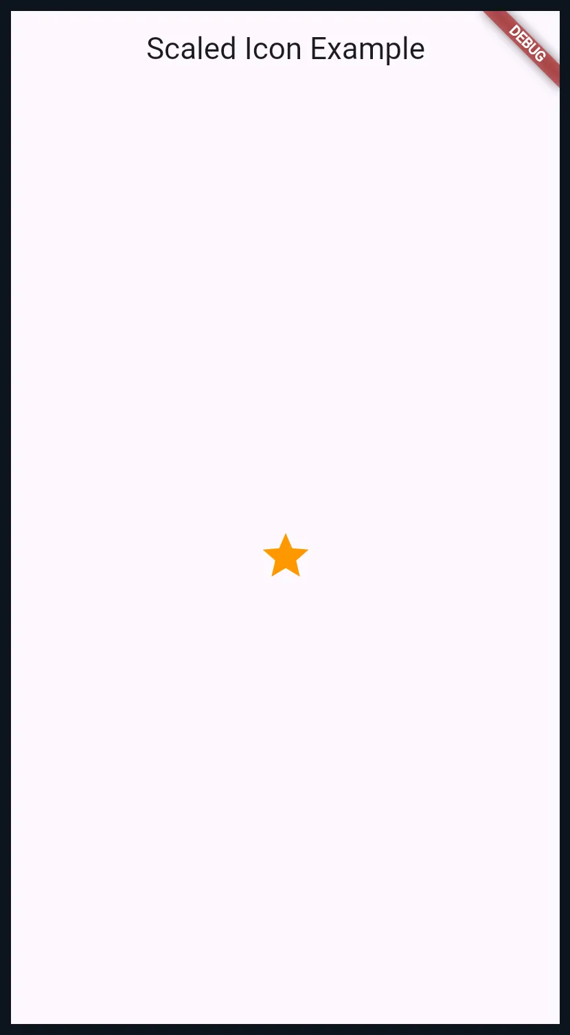
Icons also need to scale proportionally to the screen size to ensure legibility and usability. For example, a small icon may work on a compact device, but it will look awkward on a tablet.
Scaled Icon Widget
import 'package:flutter/material.dart';

void main() {
  runApp(MaterialApp(
    home: Scaffold(
      appBar: AppBar(title: Text('Scaled Icon Example')),
      body: Center(
        child: ScaledIcon(Icons.star),
      ),
    ),
  ));
}

class ScaledIcon extends StatelessWidget {
  final IconData icon;

  ScaledIcon(this.icon);

  @override
  Widget build(BuildContext context) {
    final screenWidth = MediaQuery.of(context).size.width;

    // Scale icon size based on screen width
    final iconSize = screenWidth * 0.1;

    return Icon(
      icon,
      size: iconSize,
      color: Colors.orange,
    );
  }
}
Conclusion
Adaptive design is not just about making your app look good — it’s about ensuring it works well for everyone, everywhere. By combining tools like MediaQuery, responsive widgets, and dynamic scaling, you can create interfaces that provide a seamless experience across all devices.
Start building your own adaptive layouts with these principles, and take advantage of DartPad to test and iterate quickly. A great UI adapts, and with Flutter, it’s easier than ever to make that happen.
Now it’s time to put these techniques into action — try them out in DartPad or your IDE, and see how adaptive design can transform your Flutter apps into polished, user-friendly experiences. 🚀


